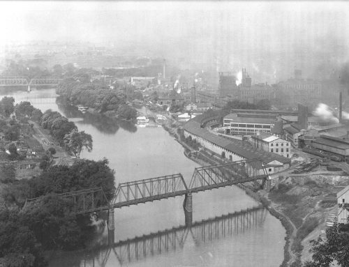
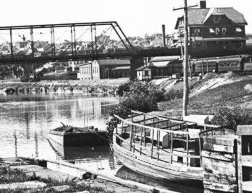
In 1913, the textile magnates Ferdinand Thun (1866-1949), Henry Janssen (1866-1948), and Gustav Oberlaender (1867-1936), formed the Wyomissing Development Company and began three years of preparatory work leading to the selection of Hegemann and Peets in 1917 to plan a “Modern Garden Suburb” on a 500-acre site across the Schuylkill River from Reading, expressing their hope that the public will appreciate how closely the efforts made by the company towards the creation of a truly modern residential park were in harmony with the best city planning thought as recorded for instance in the memorable report on Greater Reading written by John Nolen and published by the Civic Association of the City of Reading.
Expansion towards a more spacious, more fashionable west had become almost a rule with large cities when their confines proved too crowded or obsolete for the requirements of modern life. Expansion of residential and business ambitions to more suitable western quarters was the leading motive in the development of many of the greatest of old world cities, notably Paris, London and Berlin, and the same phenomenon repeats itself with even greater impetus in some of the more rapidly growing cities of the new world. Expansion to a more fashionable west was especially striking and forcible in the city of Reading, where the eastern confines are hemmed in by formidable mountains rising to over 1000 feet in height, while to the west unlimited stretches of the loveliest rolling landscape accommodated the settlement of a rapidly increasing population.
Since 1748, when Reading was laid out to cover 600 acres, the area of the city proper had increased to 5280 acres and even this enormously increased area did not house the entire population of the metropolitan district of Reading. Especially to the west large satellite communities had to be called into existence, as, for instance, the Borough of West Reading (373 acres), and especially the Borough of Wyomissing (510 acres), Reading’s garden spot, famous all over the country for its Iris and Peonies which set aglow the gentle hills framing the beautiful valley of the Wyomissing Creek.
Hard gridiron streets and endless row houses are justly blamed for making the city of Philadelphia so dreary, the only relief of the original plan being the open squares provided by William Penn. The original plan for Reading is in part a copy from the old plan for Philadelphia, but, unfortunately, the less desirable features-gridiron streets and row houses were adopted, while the redeeming feature, William Penn’s open squares, were omitted with the exception of one.
Reading, like Philadelphia, is called “a city of homes.” And it is. These buildings are not very homelike. As a rule, they are built in solid blocks of brick, with a frontage that will average only from 12 to 15 feet. The depth of the lot is usually less than 100 feet. An inspection of the city from the top of Mt. Penn, impresses one with the unnecessary congestion and overcrowding and the equally unnecessary unloveliness and cheerlessness of the city as a whole. It presents a mass of unrelieved tin-roofed brick blocks, with narrow straight streets on one side, and on the other, small and often untidy and dirty back yards and alleys.

And yet, as one gazes at the city from the heights of Mt. Penn, one’s eyes are irresistibly drawn to the beautiful open country. The plan for Wyomissing Park gave better heed to the lesson taught by the great father of the State and duly reinstated his open squares, the best part of his Philadelphia plan, to their important place in city planning. But in Hegemann and Peets plan for Wyomissing Park, these open squares, instead of being made evenly spaced geometrical features connected by the straight lines of a gridiron street system, were adapted in shape, size and location to the requirements of the rolling land and are connected by streets which are not drawn with the T-square on the drawing board, but which combined adaptation to topography and to local requirements with relation to the general scheme of main arteries, parks, squares and vistas. The monotonously repeated square public areas under this new plan became living organisms reflecting in prismatic variety the surrounding topographical conditions and the spirit of the plan at large. The creation of frequent variously shaped open squares, courts and plazas also furnish a most desirable means of strongly accentuating certain features of the topography (as slopes, plateaus, flats), which, with thoughtless planning, are often submerged in an unbending system of straight streets or in an altogether characterless adaptation of wildly winding streets to every whimsicality of the contours.
Below: Plan of Wyomissing Park by Hegemann and Peets – Use mouse or finger to move zoom circle.

While municipal or royal enterprise is largely responsible for the beauty of many of the famous cities of Europe, the American city, wherever it excels by first-class achievements, is largely indebted to powerful private initiative, the life-nerve of American democracy. Few things have been more severely criticized than the incongruity and lack of harmony prevalent in large sections of the average American town. Left to municipal or to small scale private efforts of non-cooperating neighbors, the results of urban and suburban development have indeed been mostly disappointing.
The creation of Wyomissing Park deserves special interest and commendation because it was not guided by the ordinary desire to profit by providing an exclusive residence park for the wealthy few. In this connection the return to William Penn’s fundamental idea of frequent open Squares, the abandonment of which was so detrimental to the beauty of the older sections of Reading, is of great consequence. By the return to Penn’s idea it became possible in Wyomissing Park to create a happy blending of homes of various cost, tied together by harmony of design, breathes the true spirit of democracy and progress for all.
In fact, this exhibition of democratic spirit is necessary to make a truly beautiful development possible. The ordinary so-called “high class” subdivision generally has something monotonous about it, insofar as all the houses resemble the standard detached “high-class” country residence. These residences very often are dotted over the ground in fairly even intervals, producing that monotonous repetition which suggested the phrase ”country house cemetery.” The spottiness resulting from the even dotting of detached country houses is little better than the tedious monotony resulting from building up street after street with small houses in connecting rows, as is customary in Philadelphia and Reading. Neither detached houses alone, nor houses in closely packed rows, but the happy combination of various elements, gives the finest effects in modern subdivision work.
In contrast to the monotony of the ordinary subdivision, built up uniformly with either rows or detached houses, stands the amalgamation of areas occupied by widely spaced houses on the one hand and units of more closely built up territory on the other hand. The happy grouping of lower priced residences in units of from two to six houses, introduces a most valuable element of variety. The arrangement of small groups makes possible the creation of those charming courts, plazas and squares, the prototypes of which count among the finest treasures of city building in historic towns. In fact, the beauty of the cities of former ages largely depended upon similar effects of squares closely framed by houses. The intelligently planned modern town, however, with its greater freedom secured by street cars and automobiles, permits combination of fine framed-in squares with the open charms of parklike districts in detached country house style. Wyomissing Park is laid out to contrast the regular beauty of the small enclosed square, against neighboring sections of open and irregular plan, thus securing an alternation of open and close textures, of garden city and city square. By this procedure the moderately priced row house becomes an element of as great artistic importance as the effective setting of the millionaire’s residence; the beauty of the one is increased by the other. This happy combination effectively refutes the undiscriminating criticism leveled against the row house, a criticism which is justified only where, as in the older parts of Reading, the abuse of this otherwise commendable type has led to the meaningless lining up of unrelated groups or to the building of endless characterless rows. Monotonous rows of houses are ugly. Short rows, well grouped, can be beautiful.
Retaining the sites natural features, which included the winding Wyomissing Creek and its surrounding meadows, Hegemann, who was cited as author of the plans text, and Peets and Hudnut, who were credited with the drawings, called for housing for a mix of social classes as well as community features, including a horseshoe-shaped business center with shops and a theater, twelve plazas, courts, and squares, and parks and playgrounds.
The plan abounded in group houses, many with rear alleys providing access to garages, anticipating that the industrial workers would own cars, although street car service was provided on Shillington Boulevard and the one- to three-mile distance to downtown Reading was touted in promotional literature as being “largely within walking distance from the heart of the City.” Hegemann and Peets combined “fine framed-in squares” enclosed by row houses with the open charms of park like districts in detached country house style…. thus securing an alternation of open and closed textures, of garden city and city square. By this procedure the moderately priced row house becomes an element of as great artistic importance as the effective setting of the millionaires residence; the beauty of the one is increased by the other. Single-family houses were to be separated by no less than 30 feet to avoid the “unpleasant effect of crowding,” and in the western reaches of the community four- and five-acre lots and larger were planned and landscaped in a manner that would allow for future subdivision. The scheme preserved large amounts of the sites beautiful landscape, threading the community with a network of open spaces, and transforming a former agricultural dump into an active recreation area. The parks and recreational spaces were to be open to all, not only residents. By 1917 four of the housing groups were laid out and built more or less according to plan.
In 1923, Wyomissing Development hired John Nolen to resuscitate the project that now focused on recently acquired land to the south, a 265-acre former nursery. Portions of the original had been given over to several large estates as well as the Reading Hospital and the Reading Public Museum, for which Nolen prepared landscape plans. In addition to laying out Parkside Drive North and Parkside Drive South along parkland bordering the Wyomissing Creek valley, connecting the grounds of the hospital and museum with Wyomissing Boulevard.
Below: Plan of Wyomissing Park by John Nolen – Use mouse or finger to move zoom circle.

Nolen covered the former nursery with a series of wide, gently curving, tree lined residential streets accommodating large house lots, hoping to make the development seem less like a typical subdivision and more like a “residential park wherein homes may be built.” Nolen provided “neighborly lanes cut through the blocks, allowing fine walks and short cuts for pedestrians, away from the automobile traffic of the street,” stressing that “the plan of Wyomissing Park is one of the first to call for proper provision for the pedestrian.” Now that automobiles put such intensive use on the road itself, it is altogether fitting that walks and paths and lanes should have special attention as a part of the recreation scheme. “Few people walk today,” wrote Nolen, “and one reason is that attractive promenades and footpaths are not provided.” Although the Wyomissing Development Company and other developers carried out most of the Nolen plan, a particularly appealing residential area around the circular Weiser Lake was not realized.
Example of housing groups laid out and built more or less according to plan.
HOLLAND SQUARE
Holland Square is the first plaza halting the downward movement of Lakeview Drive. In order to interpret stately arrangements of streets and plazas unfolding down a long hillside they have often been likened to the cascades of famous old-world gardens, as they take their way down a hill with intermediary basins sometimes halting their course, and gathering the down-flowing element in quiet areas of repose. A similar interpretation would compare Lakeview Drive with a stream originating in Lakeview Plaza and meeting its first wier in Holland Square. Holland Square forms a broad haven of rest located on a flat about 400 feet in length. This plaza is built up with harmonious facades suggesting Dutch Colonial feeling, divided into groups of two, three and five houses each. Similar opportunities to build up harmoniously entire squares of liberal proportions have since the middle ages eagerly been sought by men interested in civic beauty. In our age it takes a strong development company to realize this old ideal of city planning art. Indeed, since the time when a French king built his famous “Place Royale, ” the prototype of so many beautiful plazas, nobody has ever been placed in a better position to realize this ideal of a harmonious square than has a modern land developing company – an ideal which is ambitious enough even with houses much less expensive than those of the beautiful plaza in Paris.
Below: First sketch for the architectural development of Holland Square. The square was built up with a somewhat different grouping of the house-units.

Below: Holland Square, 2019.
TREBOR PLACE
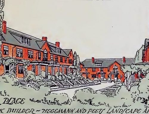
Trebor Place is important as being the first of the twelve courts to be completed and of having by its success with the home-buying public clearly demonstrated that the public appreciates the charms of building moderately priced houses in harmonious groups instead of lining them up in monotonous rows. Trebor Place is framed on three sides by groups of five houses, while the fourth side is densely planted with Lombardy poplars, promising to form a very satisfactory northern ending for the central vista through the court as seen from Franklin Street, which passes through the southern end. The planting of the individual lots of Trebor Place conforms to a harmonious scheme for the entire court.
Below: First sketch for the architectural development of Trebor Place.

Below: Trebor Place, 2011.


Leave A Comment